
Background Photos That Make Your Text Pop: A Guide
You’ve got the perfect quote. You’ve picked a killer font. You open your phone to slap it on a photo and… nothing works. The text vanishes into a sunset. Or the letters get lost in with tree branches. The whole thing looks like a design accident.
Why? The problem isn’t your text. It’s the photo underneath it.
Most people pick background photos based on how pretty the image looks on its own. But a great standalone photo and a great text graphic background are two completely different things. Once you know what to look for, you can stop spending 20 minutes scrolling through stock photos and start finding winning backgrounds in seconds.
What Makes a Photo Work Behind Text
Think of your background photo the way a stage designer thinks about a backdrop. Its job isn’t to steal the show. It’s there to set a mood, create visual interest, and stay out of the way of the main act (your words).
The photos that work best as text graphic backgrounds share a few traits:

Negative space. This is the single most important thing. Negative space means areas of the photo that are relatively empty or uniform: a stretch of sky, a blurred wall, an expanse of water, a section of solid-colored surface. This is where your text lives. Without enough negative space, your words fight the image for attention, and both lose.
Tonal consistency. A photo that swings from bright white to deep shadow in one area makes text placement a nightmare. Light text disappears on the bright spots and dark text vanishes in the shadows. The best background photos for quotes have large areas that stay within a narrow range of light and dark. Think overcast skies, soft gradients, or evenly lit surfaces.
Shallow depth of field. That blurry, dreamy quality you see in professional portrait photography? It’s not just aesthetically pleasing. It creates naturally smooth zones that are perfect for text. When the foreground subject is sharp and the background melts into soft blurs, you’ve got a built-in text placement area that practically designs itself.
Simple color palettes. Photos with two or three dominant colors are far easier to work with than busy, multi-colored scenes. A coffee cup on a wooden table against a white wall. A single flower against a dark background. A road disappearing into fog. The fewer competing colors, the easier it is to pick a text color that reads clearly.
The Photos You Should Avoid
Knowing what doesn’t work saves just as much time. Here are the usual suspects:
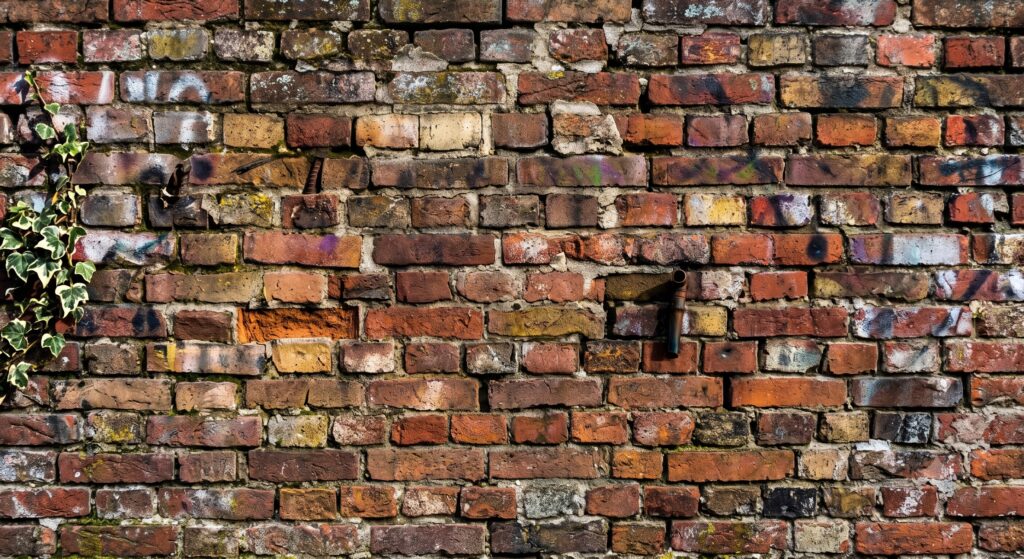
Busy patterns everywhere. Brick walls, dense foliage, crowded street scenes, detailed fabrics. These photos might look fantastic in a gallery, but they’re a text placement nightmare. When every square inch of the image has visual detail competing for attention, there’s nowhere for your words to breathe.
High-contrast scenes with no buffer zones. A photo of a black cat on a white couch is striking. It’s also nearly impossible to put text on, because there’s no area with consistent enough tone to hold readable letters.
Multiple focal points. A group photo at a party. A table full of food. A landscape crammed with buildings, trees, and people. When the eye bounces around the image, adding text just creates chaos. The best backgrounds have one clear focal point or no focal point at all.
Overly saturated colors. Neon sunsets, hyper-vivid cityscapes, HDR-processed landscapes. They fight with text for visual dominance. More muted, slightly desaturated images tend to let your words sit on top comfortably.
Where to Find Background Photos That Actually Work
Not all stock photo sites are created equal when you’re looking specifically for text graphic backgrounds. Here’s where to look and what to search for:
Unsplash is the gold standard for free photos with natural, editorial-quality images. The trick is to search with text-background-specific terms. Instead of searching “nature,” try “minimal landscape” or “abstract texture.” Instead of “coffee,” try “coffee table overhead flat lay.” Adding words like “minimal,” “negative space,” “blurred,” or “simple” to any search dramatically improves the results.
Pexels has a similar library with slightly different curation. Their category pages for “backgrounds” and “textures” are worth bookmarking. The search filters for color and orientation help you narrow things down fast.
Pixabay tends to have more abstract and texture-based images that work well behind text. Think watercolor washes, gradient overlays, paper textures, and solid-color surfaces.
Your own camera roll. Honestly, some of the best background photos for quotes are ones you already have on your phone. That slightly out-of-focus shot of the sky you took last week? The close-up of your desk with the shallow depth of field? Photos you’d normally delete can be perfect behind text.
Word Swag‘s built-in background library is also curated specifically for text placement, which takes a lot of the guesswork out of the equation.
Tip for searching: When you find a photo you love on any stock site, look at the photographer’s profile. People who shoot good text backgrounds tend to have entire portfolios of them. Follow those photographers and you’ll have a steady stream of usable images.
Practical Tests Before You Commit
Found a photo that looks promising? Run it through these quick mental checks before you start designing:
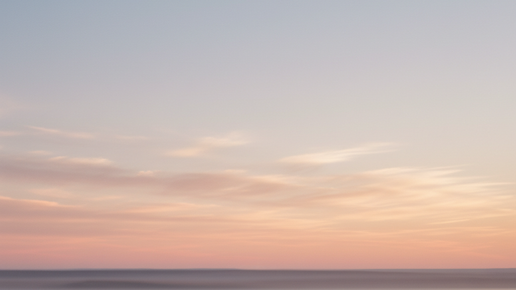
The squint test. Squint at the photo so it goes blurry. If you can still see distinct shapes and patterns competing for attention, the photo is probably too busy. If it reduces to soft color blocks, you’ve got a winner.
The thirds test. Mentally divide the photo into thirds, both horizontally and vertically. Is there at least one third of the image that’s relatively clear? That’s your text zone. If every section has competing detail, move on.
The color count. How many dominant colors do you see? One or two is ideal. Three is fine. More than that and you’ll struggle to find a text color that works.
The brightness check. Is the photo extremely dark or extremely bright? Both extremes limit your text color options to exactly one (white on dark, black on light). Photos in the mid-range give you the most flexibility.
Here’s a practical example. Say you’re creating an inspirational quote graphic for Instagram. You find two sunset photos. The first is a dramatic sky with orange, pink, purple, and blue streaks, silhouetted palm trees, and a detailed foreground. The second is a soft, hazy sunset with a wide gradient from warm peach to pale blue, no foreground elements. The second photo is almost always the better text background, even though the first one gets more likes as a standalone image.
Editing Photos to Work Better as Backgrounds
Sometimes you find a photo that’s almost right but needs a little help. A few simple edits can turn a decent photo into a perfect text background:
Crop tighter on the negative space. If a photo has a great sky but distracting foreground, crop the foreground out. You don’t need the whole composition. You just need the part that works behind text.
Reduce saturation by 15-25%. This simple move calms down competing colors and lets your text stand out more. You’re not making the photo black and white. You’re just dialing back the intensity enough so the words take center stage.
Add a slight blur. Apps like Word Swag let you adjust the background, which can soften busy areas just enough for text to read clearly. Even a small amount of blur on specific zones makes a difference.
Darken or lighten selectively. If you know your text will be white, darken the area where the text will sit. If your text will be dark, lighten that zone. This creates a natural pocket for your words without needing a full overlay.
Use a color overlay. A semi-transparent color layer between the photo and your text works wonders on photos that are almost-but-not-quite right. A 20-30% black overlay makes white text pop on nearly any photo. A colored overlay can match your brand while taming a busy background.
Building a Background Photo Library
The biggest time-saver is not searching for the right photo every time you create a post. Instead, build a library in advance.
Set aside 30 minutes once a month to browse stock sites and save 20-30 background photos that pass your tests. Organize them by mood or color: bright and airy, dark and moody, warm tones, cool tones, textures, minimalist. When it’s time to create a graphic, you pull from your curated collection instead of scrolling through thousands of results.
On your phone, create a dedicated album called “Text Backgrounds” in your camera roll. Every time you snap a photo that has good negative space or interesting texture, drop it in there. After a few weeks, you’ll have a personal stock library that nobody else is using, which means your graphics will look different from everyone posting the same Unsplash photos.
If you’re using Word Swag, you can save your favorite backgrounds as part of saved projects, which makes it easy to reuse winning photo-and-text combinations for future posts.
The 80/20 of Background Selection
If you take only one thing from this article, make it this: look for negative space first, everything else second. A mediocre photo with great negative space will produce a better text graphic than a stunning photo with no room for words.
Train your eye by scrolling through your Instagram feed and noticing which quote graphics catch your attention. The ones that work will usually have the text sitting in a clean, uncluttered zone of the image.
Start building your background library this week. Save ten photos from any stock site that pass the squint test. Then create a few graphics and see how much faster the whole process feels when you’re not fighting the background for space. Your text will read better, your graphics will look more professional, and you’ll spend a lot less time wondering why that perfect quote looks terrible on that beautiful photo. Good luck!