Social Media Image Sizes for Every Platform in 2026
You designed the perfect graphic, posted it, and then watched the platform chop off your headline. Or squish your logo. Or turn your carefully composed layout into a blurry mess with black bars on the sides.
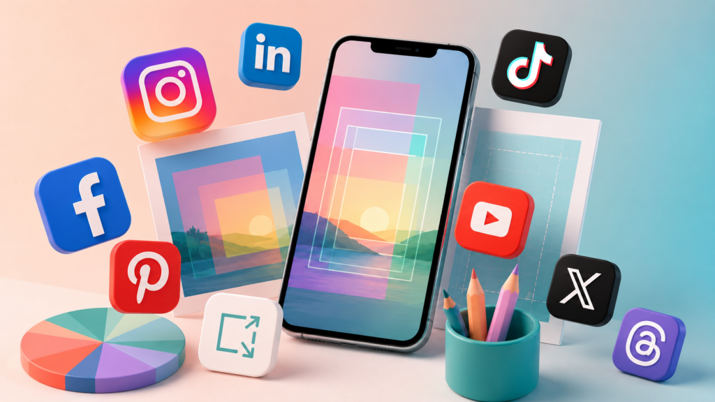
Every platform has its own preferred dimensions, and they change more often than you’d think! What worked last year might crop differently now. This is the updated reference for 2026, covering the eight platforms that matter most for businesses and creators.
Before you do anything, go ahead and bookmark this page now for future reference.
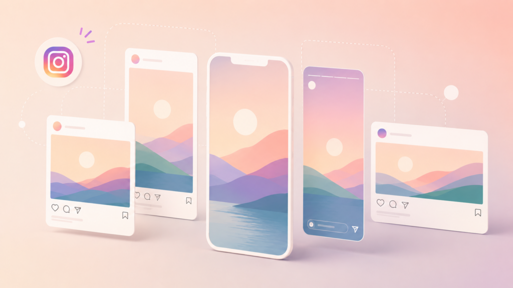
Instagram supports more formats than it used to, and each one behaves differently in the feed:
Feed post (square): 1080 x 1080 px (1:1 ratio). Still the classic. Looks clean on your grid and works well for quotes, product shots, and infographics.
Feed post (portrait): 1080 x 1440 px (3:4 ratio). Portrait gives you maximum feed real estate. A 3:4 image takes up more vertical space on someone’s screen, which means more time before they scroll past. If you’re only picking one format for Instagram feed posts, this is it. (Note: until last year they used to only support 4:5 but added support for 3:4 which is the default aspect most phones shoot at. Yay!) However, if you’re publishing on multiple platforms, you could always choose to do 4:5 instead of 3:4, because almost all platforms support 4:5. While Instagram works better with 3:4, especially since the grid crops to 3:4, you can always choose to save yourself work and stick to 4:5 if you’re posting to multiple places. For reference, 4:5 is 1080 x 1350 px.
Feed post (landscape): 1080 x 566 px (1.91:1 ratio). Rarely the best choice. It leaves white space above and below in the feed and shrinks your visual impact. Skip this unless you have a specific reason.
Stories and Reels: 1080 x 1920 px (9:16 ratio). Full-screen vertical. Keep text and important elements inside the center safe zone, roughly 1080 x 1420 px. The top and bottom 250 px on each side get covered by the username bar and swipe-up/CTA elements.
Carousel posts: Same dimensions as feed posts (1080 x 1080 or 1080 x 1440), but all slides in a carousel must share the same aspect ratio. The first slide sets the ratio for every slide that follows.
Profile photo: 320 x 320 px. Displays as a circle, so keep everything centered and away from the edges.
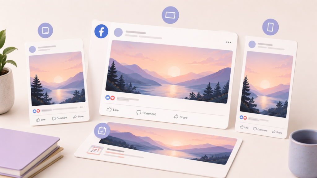
Facebook compresses images more aggressively than other platforms, so starting with high-quality source files matters here.
Feed post (image): 1200 x 630 px (1.91:1 ratio). Facebook’s preferred landscape format. This also controls how your shared links preview when someone posts your URL.
Feed post (square): 1080 x 1080 px. Works well and takes up decent space in the feed. A solid default.
Feed post (portrait): 1080 x 1350 px. Facebook supports this, and like Instagram, it claims more vertical space. Good option for mobile-first content.
Stories: 1080 x 1920 px (9:16). Same as Instagram Stories. If you design for Instagram Stories first, you can reuse the same graphic on Facebook without changes.
Cover photo: 1640 x 924 px. Displays differently on desktop vs. mobile, so keep critical text and logos in the center 1200 x 630 px zone. The edges get cropped on mobile.
Event cover: 1920 x 1005 px. Wider than the page cover. Don’t put important text in the bottom 100 px since it gets overlapped by event details.
Profile photo: 176 x 176 px (displays as circle on most views). Upload at 360 x 360 px minimum for sharpness.
LinkedIn’s visual game has gotten stronger. Posts with images consistently outperform text-only posts here, and the platform has stopped being purely a text-heavy feed.
Feed post (single image): 1200 x 1200 px (1:1) or 1200 x 628 px (1.91:1). Square images work surprisingly well on LinkedIn and stand out because most users default to landscape.
Feed post (portrait): 1080 x 1350 px (4:5). Supported, and it grabs attention in the feed just like on Instagram.
Article cover image: 1200 x 644 px. Used when you publish a LinkedIn article (different from a post). Displays at the top of the article.
Company page cover: 1128 x 191 px. This is a wide, thin banner. Keep it simple. Text needs to be large to be readable at this aspect ratio.
Profile photo: 400 x 400 px. Circle crop. Same rules as everywhere else: center your face or logo.
TikTok
TikTok is vertical-first and full-screen. There’s not much variation here.
Video/photo post: 1080 x 1920 px (9:16). This is the format for everything. Photo carousels, video posts, all of it.
Safe zone: Keep text within the center 1080 x 1420 px area. TikTok’s UI covers the bottom of the screen with the caption, music info, and interaction buttons. It also covers the top with the Following/For You tabs. If your text extends into those zones, it’s going to get buried.
Profile photo: 200 x 200 px minimum. Circle display. Upload at 400 x 400 for better quality.
Pinterest is the one platform where vertical content isn’t just preferred, it’s practically required. Tall pins dominate the grid.
Standard pin: 1000 x 1500 px (2:3 ratio). This is the sweet spot. Pinterest recommends 2:3, and pins at this ratio get the best distribution in the Smart Feed.
Long pin: 1000 x 2100 px (or up to 1:3 ratio). Useful for infographics and step-by-step content. Be aware that anything taller than 1:3 gets truncated in the feed, and users have to tap to see the full image.
Square pin: 1000 x 1000 px. Technically works, but takes up less visual space in the grid. Not ideal.
Idea pin (multi-page): 1080 x 1920 px (9:16). Full-screen vertical, similar to Stories on other platforms.
Profile photo: 165 x 165 px display. Upload at 330 x 330 px or larger.
YouTube
YouTube has several image types, and each one matters for different reasons.
Thumbnail: 1280 x 720 px (16:9). This might be the single most important image you create on YouTube. Thumbnails drive clicks, and they show up tiny on mobile and larger on TV screens. Design for mobile first. Keep text large (three to five words max) and faces prominent. TIP: Test different thumbnails the first few days after publishing a video to find the one that garners the most taps and clicks.
Channel banner: 2560 x 1440 px. This is the full file size, but the safe zone for all devices is the center 1546 x 423 px. Design your key message in that center strip, and let the outer area be background that can get cropped without losing anything important.
Shorts: 1080 x 1920 px (9:16). Same as TikTok and Instagram Reels. If you’re creating short-form vertical video, one set of dimensions works across all three platforms.
Community post image: 1200 x 1200 px. Square format works best in the Community tab.
X (formerly Twitter)
X displays images in the feed with different crops depending on how many images are in the post.
Single image: 1600 x 900 px (16:9). This displays fully expanded in the timeline without users needing to tap.
Square option: 1200 x 1200 px. Works fine, but slightly less feed space than 16:9.
Two images in one post: Each displays at roughly 700 x 800 px (7:8 ratio). They sit side by side.
Header/banner: 1500 x 500 px (3:1). Very wide and short. Simple graphics or patterns work best here. Detailed text is hard to read at this ratio.
Profile photo: 400 x 400 px. Circle crop.
Threads
Threads keeps things relatively simple since the platform is text-focused with image support.
Feed image: 1080 x 1350 px (4:5) works best. Square (1080 x 1080) also displays well.
Maximum width: Threads caps image display width, so going above 1080 px wide doesn’t add visible quality.
Profile photo: Synced from your Instagram account. Update it there, and it changes on Threads automatically.
Tips for Cropping One Image Across Multiple Platforms
Creating separate graphics for every platform sounds exhausting, and it is. Here’s how to work smarter.
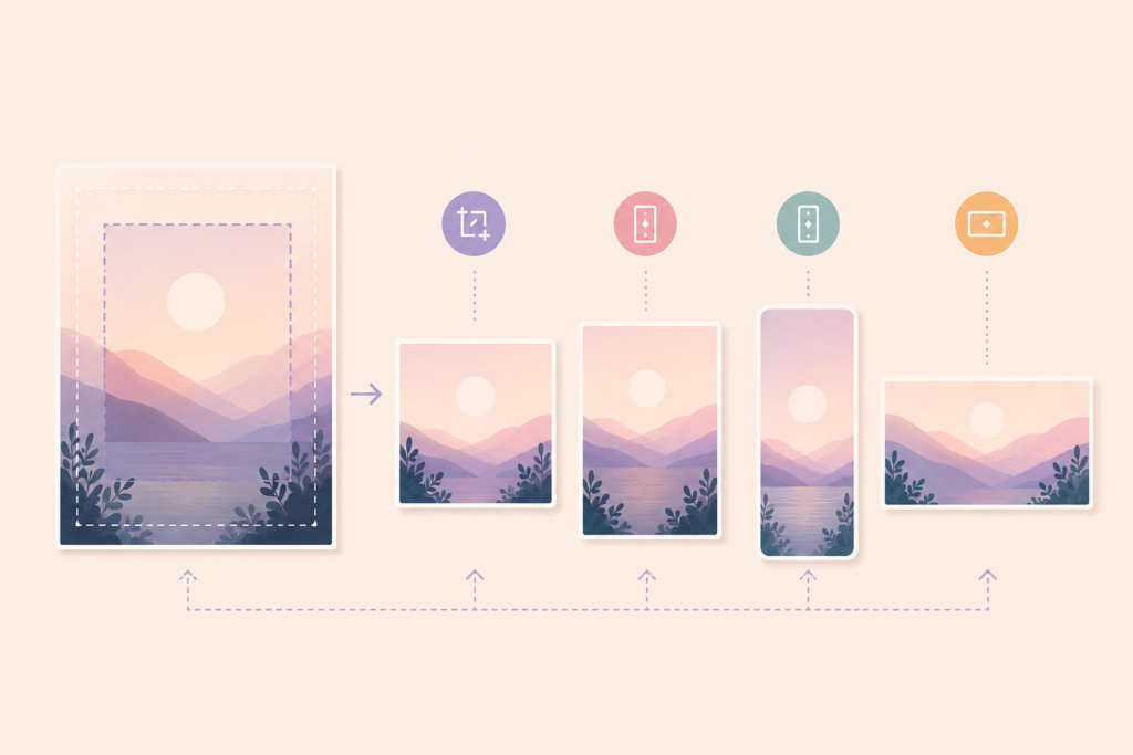
Start with 1080 x 1350 (4:5 portrait). This single size works natively on Instagram feed, Facebook, LinkedIn, and Threads. It’s also the easiest to crop down to square (1080 x 1080) by trimming the top and bottom.
Design with a “center safe zone” mindset. Put your most important content, your headline, key image, or logo, in the center 1080 x 1080 area of any graphic. That way, you can crop to square, landscape, or vertical from the same source file and never lose the important stuff.
Use 9:16 for all short-form vertical content. 1080 x 1920 works identically on Instagram Stories, Instagram Reels, TikTok, YouTube Shorts, Facebook Stories, and Pinterest Idea Pins. One design, six platforms.
Keep text away from edges. This is true everywhere, but especially for vertical content. Every platform layers its own UI elements (usernames, buttons, captions) over the top and bottom of full-screen content. A good rule of thumb: stay 250 px away from the top and bottom edges on any 9:16 graphic.
An app like Word Swag can help here since it lets you resize graphics between formats right on your phone. Design once, export at multiple sizes, and move on with your day.
Quick Reference Table
Here’s the cheat sheet version. Bookmark it, screenshot it, whatever works.
| PLATFORM | BEST FEED SIZE | STORIES / REELS / SHORTS | PROFILE PHOTO |
| 3:4 (1080 x 1440) or 4:5 (1080 x 1350) | 9:16 (1080 x 1920) | 1:1 (320 x 320) | |
| 1.91:1 (1200 x 630), but can use 4:5 | 9:16 (1080 x 1920) | 1:1 (360 x 360) | |
| 1:1 (1200 x 1200), but can use 4:5 | N/A | 1:1 (400 x 400) | |
| TikTok | 9:16 (1080 x 1920) | 9:16 (1080 x 1920) | 1:1 (400 x 400) |
| 2:3 (1000 x 1500) | 9:16 (1080 x 1920) | 1:1 (330 x 330) | |
| YouTube | 16:9 (1280 x 720) (thumb) | 16:9 (1080 x 1920) | 1:1 (800 x 800) (channel icon) |
| X | 16:9 (1600 x 900) | N/A | 1:1 (400 x 400) |
| Threads | 4:5 (1080 x 1350) | N/A | N/A |
Platforms tweak these numbers periodically, but the core ratios (1:1, 4:5, 9:16, 16:9) have been consistently supported. Get those four ratios down, export at a higher resolution (like in Word Swag app) so images are always clear, and you can adapt to any future change without panic.
Now go make something that doesn’t get cut off!